Christine Boland, a trend analyst with over 30 years experience, is an expert at identifying relevant trends in consumer behaviour. Here she provides a summary of her bi-annual Design Language analysis for winter 22-23: SYMBIOTIC SCENARIOS.
People are being driven apart by the insecurity caused by the pandemic. Opposing “camps” continue to emerge, forming around different opinions and ideas. Everything is now geared towards turning the tide. It is time to stop demonizing those with whom you don’t agree, listen more closely to one another and build bridges again. Connecting us to the people and the natural world around us. This need is evident in design, which, as usual, offers some impressive examples. We see extremes harmoniously blending everywhere. You will see extremes blending together everywhere: cultivated and wild; modern and indigenous; science and craft; technology and craft; science and the senses; realism and surrealism; female and strong; scary and fairy-like, intelligence and intuition; body and mind.
This is the winter 2022-23 theme, or so-called “SYMBIOTIC SCENARIOS”:
#1 SURVIVING ANTHROPOCENE
The Anthropocene refers to the time when the earth’s climate and atmosphere began to reflect the effects of human activity. It’s at a critical tipping point right now, with the Covid pandemic being the most extreme example. Mother Earth is being asked too many things. Overconsumption, pollution and loss of biodiversity are all problems. It is urgent that man and nature work together in a mutually beneficial, cyclical partnership. The design language is therefore all about utility, survivalism, protection and recycling.
This trend is all about high-tech, refined designs.
It’s all about natural colours, such as mud, stone and grass, and brighter flashes like viridis greens, ochres and brick tones.
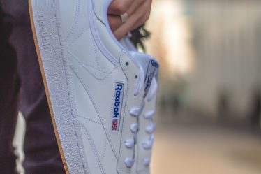
#2 TRANSCENDING LIMITATIONS
We are moving from a digital world to a physical world. Digital and physical merge. There is no distinction between real and rendered time, as the boundaries between them blur. This parallel universe of artificial intelligence, mixed reality, virtual reality, augmented reality and virtual reality is available in any direction. Great examples are Travis Scott’s virtual concert in Fortnite, and Cardi B’s polished campaign for Reebok. Designers are creating fantasies with an explosion in creativity.
This trend is characterized by a variety of style features, including gradient, sheer, shiny, and metallic fabrics, effects that include a large role for silver or titanium, retro-futurism with patterns with art deco, 60’s inspired prints, and blobby volumes. These volumes are puffed and padded and have sculpted silhouettes that transcend reality.
Retro screen colours and translucent colours are the key colours. They have a cool undertone, such as lavender, frosted, greyish jade and sea-green. This is contrasted with cloud white, black, and a light mahogany.
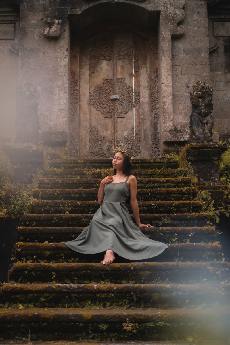
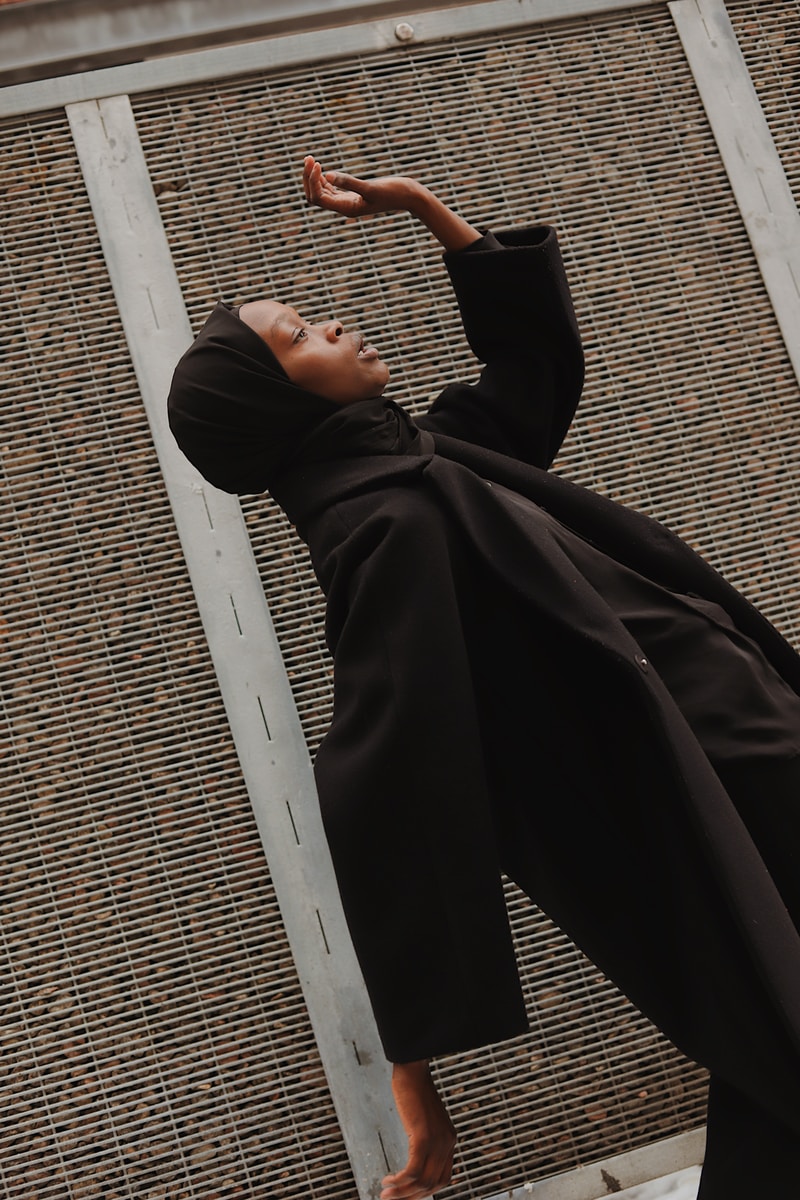
#3 UNLEASH FEMALE FORCE
We are moving towards a more feminine age. This is evident in many developments and events. Just look at the newly appointed female prime ministers of Northern Europe. The accepted norm will be a more feminine approach to doing things. It will shift from being purpose-focused to being process-focused, from confrontation to compassion, and from individualism towards holism and inclusion. Design language reveals a new beauty that challenges the stereotypes. There is a lot of invisible feminine force that is full of romanticism and mysticism.
This trend’s most prominent style elements are delicate, yet strong, structures and materials.
The colour palette is all about feminine hues with a mystic undertone. It includes midnight blues, muted petrol and fiery reds as well as carmine pink and saturated brights such soft pink, apricot, and coral.
#4 INTEGRATING SICENCE & SENSES
We have been shaken to our core by the pandemic’s unpredictable unpredictability and unpredictable outcomes. We have lost our balance, caught between hopelessness and insecurity. We need to rebalance and get back on track. Our number one priority is wellbeing. The importance of braincare and brainhealth has increased and is now intertwined with fashion, fabrics, and interior design. This has led to a design language that is visual yoga with lots of integrated technology.
Its style features include soothing shapes, silhouettes and fabrics.
The key colours are soft, delicate and harmonious. You can think of sandy tones, as well as powder makeup colours like soft pinks and golds, lilacs and clay, and terracotta. Reddish brown and pine green are the only ones that have darker tones.